As this was my very first hands on experience with both filming and editing it helped grasp the basics enabling me to produce my short film. The feedback I received for my prelim task wasn't so positive as we were short for time when producing the 1 minute short film. However, some feedback included'
"The whole concept of the feet is a really good idea, I would've never have thought of that myself! The quality isn't great but I know you were limited to what the school has to offer"
"I like the use of the sound of the school bell ringing as the students walk into school, however I feel that it needs a song playing whilst the people are walking to make it more rememberable."
"The camera is a bit all over the place and the shot is wonky which prevents it from looking professional"
This feedback really helped give me an insight to what I needed to improve on when it came to producing my short film. Firstly, I new straight away without the feedback given that the quality was very poor as I was limited to what the school had to offer. Each comment on my prelim task all comment on something that prevents it from looking professional, whether it being the quality, the equipment or the lack of sound. With this is mind, I was able to explore ways in which I could prevent this from bing said about my short film. By making it better, I did go out and buy myself a Sony NEX 7 camera that not only helped me produce a 100% more better short film for A Level, but will also see me through university studying further on in media and filmmaking. Instead of having to borrow the schools tripods and cameras made it easier for me to be more flexible when it came to deciding on my planning, especially the call sheet for assistants and actors as it was easy to access my own equipment that I didn't have to worry about losing, damaging or forgetting to take back. However, on the other hand, some people gave positive feedback on the initial idea and the whole concept of the feet walking and the close ups, this was reassuring as it helped me realise that I had good ideas that were further on enlightened by the improvement of equipment, quality and talent in my short film.
My Short Film...
I have learnt numerous things from my audiences positive feedback. Firstly, when I had completed my first draft:
I left my unfinished, first attempt on the screen of my mac computer open for my class mates to watch. Once it was watched by several people I was able to gather a fair amount of feedback that was very reliable as it wasn't just good comments made by my friends, it was notes on how to improve to then make things clearer for my target audience. Such feedback included;
"I like title and how it comes up, however, maybe some narrating at the beginning although it is also effective how it is already."
"The end is slightly confusing, could make it a little clearer. The camera shots and music all work really well together and there is a clear symbolisation of the flash backs."
"Perhaps use a quick cross fade between actresses"
This honest feedback then helped me to focus on specific elements to help my short film look better. I started to focus on the comment on the narrative and decided to add a voiceover of actresses, however, as they say don't work with children, I have found it significantly hard to direct a 7 year old to speak the narrative. Although I still plan to work around this and perhaps have an older actor who I can work easier with to produce what I want.
Secondly, I then asked about the supposedly "confusing" part of my short film. This I figured was created at the end as in this first draft it is not all finished, so for anybody to watch this, it would appear confusing. Therefore, to prevent this, in my next draft I focused more on the end to make it much more clearer. And to make sure the end is definitely clear, once it is finished I will go around and gather more feedback to make it fair. Lastly, despite other comments saying that there is a clear symbolisation of the flashbacks, some others didn't think so. One comment suggested to have quick cross fades between the actresses, however, the flashbacks are were not in my first draft therefore some of my target audience perhaps didn't understand what was happening despite writing on the page so they could read what was missing...
Above the negative feedback that helped me tremendously improve specific elements of my short film, I also gathered a lot of positive feedback that lead me to think that I was on the right track;
"The music used fits really well and the opening shots are really effective due to their high quality. Really good range of camera angles and effects of the text helps build a sense of variety."
"Very well edited, the shots were well constructed and flow together nicely. I love the concept of the character ageing. I think you've portrayed this very well by keeping similar clothes/location. The music fits well, well done."
"I like the use of music, especially the heartbeat at the end."
This positive feedback really helped me feel good about what I had produced. Certain feedback commented well on the music, so in this case I kept the music the same in my final draft. Another also likes the use of the heartbeat towards the end, so I kept the use of the ambient sound to help create an atmosphere when watching the film. lastly, I got several good comments on the different range of camera angles and shots, which I was very happy about as to have diverse camera techniques, shots and angles was one of the main tasks for our short film.
This is one of my final drafts for my short film and as you can see I have added in the flash backs and the end to help it have a clearer storyline. Although I have kept the same music, text, and actors. When showing this to my target audience now I get great feedback as it makes much more sense now and it flows, also that the flashbacks work really well with the whole concept of the film and the storyline to make it more consistent and dramatic with the young girl.
My Short Film Poster...
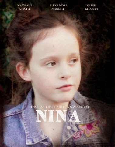
This was my original draft of my short film poster, and below is some of the feedback I got on it;
"I like the image, I feel that it works well with the film idea. Although it looks quite bland as there are empty spaces which don't catch my eye"
I like the contrast of the bright, white writing against the dull picture, but there isn't much to look at"
I think you could fill in the space at the bottom with blocking text with all the short films details, like the director, editor, actors..."
After reading my feedback I realised straight away that my poster was missing something and it looked very basic and too much like a lot of other film posters. Firstly, one of the main issues was that my poster was missing something at the bottom, as said, "blocking text" which consists of the films details. I also figured that perhaps my short film poster needed something that helped it stand out. I analysed real short film posters in order to gain a wide knowledge of them. After seeing one with a very similar film idea, their film poster was landscape, so I decided to have mine landscape rather than portrait. I wanted this to help it become unusual and different, after all my short film goes against the Todorov theory as it ends on a disequilibrium where the audience are left on a cliff hanger. Furthermore, I also figured that the main image needed to be more eye catching for my target audience otherwise the purpose of my short film poster to attract my audience to make them want to watch it, won't happen.

As this was only my second but final draft I felt as though a lot of the feedback I was getting along the way reassured me to think that I have created and composed the best I possibly could. After making changes to my film poster I now realise what I was missing in the first place. I followed the feedback and added a blocking text at the bottom containing the films details, such as the director, actors and editor... etc.I also edited it on pixlr so it was landscape, this enabled me to have a larger image to help gain my target audiences eye. My audience feedback on my first draft has really helped me produce a much better film poster that i though I could never make. Even though a lot of the feedback has been negative and ways of improvement, the criticism has helped me grasp a wider range of knowledge on what people are looking for and what they prefer despite my opinion.
My Magazine Film Review...

This was my first draft for my short film magazine review and as you can see from below I progressed a lot enabling me to produce a much better film review. After completing this draft, I then asked several people, male and female of all ages to give me feedback in ways I could improve. Such as;
"I really like the style but at the same time I feel that it lacks in colour, there's a lot of blank spaces that you could fill with important information or more pictures."
I like the font, I feel that it really suits the genre. However, there are a few black spaces which you wouldn't see in a real magazine"
"I love the use of images and how you have pictures of behind the scenes with the main character operating the camera. It's interesting to see!"
This feedback is really important to me as I got feedback from people who gave criticism and true, honest opinions rather than those those who give only positive feedback. This made it more reliable enabling me to really work on improvement, in this case, I learned that I needed to add more colour and information or pictures to make it more engaging for my target audience.

This is my final draft for my short film magazine film review and I am pleased to say it is a massive improvement from the first draft. Without the feedback I was given I wouldn't have been able to produce this film review as I wouldn't have known what to improve, change or keep the same. As you can see I have added colour to make it have a colour scheme thats not too in your face but is bright enough to catch someone eye. Due to the complement on the style of font I used, I have kept it the same, this also enables me to have my own house font as it is the same font I used on my film poster and the text (credits and title) in my short film. Lastly, I also took on board the criticism about the blank spaces, therefore, I have filled all of these to help it look more professional and as said in my feedback, more like "real existing text".
No comments:
Post a Comment